

When you walk into a room to pitch investors, the first thing they see is how you’re dressed. You haven’t said a word but they’re already appraising you based on your outfit, how you walk and carry yourself. When you speak, it’s a continuation of the first impression you made when you walked into the room.
That’s how hard your homepage content works for your brand. Your homepage probably receives the most traffic on your website. For many visitors, your homepage is the only interaction they have with your company. You want visitors to fall in love at first glance and feel right at home.
Hence, the big question – what should I put on my homepage?
It’s a confusing question because there’s no one-size fit for all homepage content.
SaaS brands like to design their homepage to act as landing pages with minimal top navigation. They want you to focus on one action, which is usually to sign up for a free trial of a product they’re selling.
Companies in the finance world or those offering complex services have a content-heavy homepage to explain what they do, how they can serve you and build trust with their audience.
Different folks, different strokes.
Do you create:
- Content that positions you as the ideal solution to a problem?
- Content that prospective buyers are looking for?
- A healthy mix of a and b?
Ideally, you want to satisfy the user’s search intent, build trust and position your brand as the ONLY solution worth going for. Do this right and your visitors are more likely to click a button that leads them to the next stage in your funnel.
What Is the Purpose of the Homepage?
The purpose of the homepage is to:
- Deliver content to the user
- Bring the user closer to the page they’re looking for
There’s no witchy witchy mind trick to writing homepage content that converts. But how important is the homepage content to your online marketing strategy?
In 2010, popular digital customer experience specialist, Gerry McGovern wrote a superb piece titled, “the decline of the homepage.” In the article, he shared data to show that web users are navigating directly to other pages on a website, not the homepage. Web usage becomes more specific as it matures.
Gerry explains that customers don’t want to get to your homepage. Rather, the homepage should serve as a signpost leading them in the right direction.
Think Gerry’s information is outdated?
 Image Source
In 2017, UX and automation expert, Nick Babich argued that the homepage might be the least important page on the site.
The starting point could be any page on your site and the vast majority of web visitors may never see your homepage.
Why the heck should you bother with web design or copywriting on your homepage?
If you add meaningless text or information that isn’t connected to the visitor’s need, your homepage fails.
Your homepage is also the platform to make your ultimate brand statement. Everything about the page from design, images, widgets, headlines, and typeface should convey your brand values.
It may be a challenge to balance value-driven design with problem-solving for the user. But if you adopt a holistic approach to user experience, your homepage functions as a brand-supported gateway that provides information the user seeks.
Before Writing, Answer These Questions
Who Is Your Target Audience?
In marketing, a target audience is a group of people most likely to respond to your marketing asset (product page, landing page or squeeze page) by converting.
As a business owner, you serve a specific audience. Instead of targeting everyone, narrow your audience to the smallest group of people who want and have the means to acquire your service or product.
What Pain Points do They Have?
It’s only when you know your audience that you can identify their biggest pain points. Pain points are the needs and challenges that weigh your audience down.
The keys to identifying your target audience include:
- Determine the problem you’ll solve
- Identify the people likely to be suffering from these problems
- Analyze what your competitors are doing
- Build detailed demographics
- Identify their motives, both personal and professional
- Identify potential opportunities to help them achieve their goals
- Create a game plan for achieving results
What Is Your Value Proposition?
Put simply, your value proposition is the value you’ll deliver to your customers. It’s the answer to the question “Why should I buy from you?”
A great value proposition introduces you to potential customers and makes a powerful first impression. It describes:
- The benefits of your product or service
- How you’ll solve a specific pain point the prospective buyer faces
- Why customers should buy from you
What Should be on Your Homepage?
- Logo
- Phone number
- CTA Button
- Above the Fold CTA
- A compelling headline
- Hero Image
- Featured with benefits
- Multiple offers
- Navigation to resources
- Social proof
- Footer text

Logo
Your company logo sits at the top-left corner of your website. It is the core of your branding, and it should be visible for everyone to see. Surround your logo with negative space so it stands out.
Sometimes, the logo doubles as a link to the homepage. It makes it easy for visitors to navigate back to the starting point when browsing for information on your site.
Phone number
How many people walk around with a business card anymore? It’s easier to share your website’s name with potential clients, send it over on an instant messaging platform or email.
But how do they get in touch? A visible phone number at the top right corner or center of your homepage makes it easy for potential customers to reach you.
A Kissmetrics study revealed that adding a phone number increases the number of visitors who become customers.
 Flowr.com was one of the brands that participated in the study. They ran an A/B test with one variation of the homepage including a phone number to chat with customer care. Conversion increased by .5% with the variant that had a phone number.
According to Sean Work, the former marketing director at KISSmetrics, a phone number on the homepage brings peace of mind to the people you do business with. It builds trust and removes the fear that you’re not in business for the long run.
CTA Button
While your homepage will likely have multiple calls to action buttons, the CTA at the top will be the most prominent.
Include ONE call to action above the fold that directs web visitors to take the next action in your buying cycle.
The primary CTA on your homepage should feature a contrasting color that sets it apart from the rest of the page. I like to keep the CTA copy within 5 words, action-oriented and compelling.
Check your CTA on a mobile screen. Is it big enough to touch with a finger? HubSpot recommends button sizes of 44px by 44px. Add whitespace around the CTA button to avoid visitors clicking on something else.
 I’ve got one button at the top of my homepage and it leads the visitor to the contact page where they can either book a free consultation or send an email to me.
That big, yellow CTA button ensures that everyone visiting the Zenith Copy homepage knows what to do.
Above the fold CTA
Above the fold is considered prime real estate on a website. A study published by Google revealed that ads placed above the fold enjoyed 69% more views than those below the fold.
However, conversion expert Joanna Wiebe says you shouldn’t cram everything above the fold. Visitors are willing to scroll if there’s information worth seeing.
In the same vein, landing page expert Oli Gardner says that placing your CTA above the fold may be asking too much from a new visitor who’s interacting with your brand for the first time.
So, what’s the best practice for optimizing above the fold?
 Image Source
Be intentional with your messaging. Add a lead magnet to communicate the intent and value of your product instantly. It makes it easy to sign up low hanging fruits. But this only works if your value proposition is clearly articulated like Skype.
Add a benefit-driven headline centered around your value proposition. It ensures you’re not missing out on the opportunity to turn visitors into leads.
Headline
Perhaps the hardest working element on your homepage, the headline has to communicate your value and offer to the visitor in three seconds.
Rather than trying to please everyone, write a headline targeted at the 20-35% of visitors most likely to buy your product or service.
A few tips for writing powerful headlines include:
- Use simple words. No one should have to think hard to figure out what you do.
- People are emotional beings. Connect with emotional words that build bridges.
- Include your primary benefit or value in the headline.
- Incorporate your homepage keyword.
- A/B test your headline to find the best variation.
Headline Image or Hero Shot
This is the main image that sits at the top of the homepage. It is an important homepage element because people are visual. Use an image that captures the emotion you want to convey and causes action.
Your headline image should blend with your logo and above the fold information. Combine verbal and visual elements to inspire visitors to interact further with your website.
I particularly like sites that use images or short videos to create a desire for the product. For example, looking at this meal from 4 Rivers Smokehouse makes me hungry!

Sell Features with Benefits
There’s a lot of talk on communicating the benefits of your product. But finding a marriage between features and benefits brings it all together for the prospect.
Features help visitors understand what’s included in your product or services. Benefits describe why what you do matters.
Keep the copy light and easy to read. A few ways to present the information include:
- In rows
- A list
- Separate sections of features and benefits
- A grid
Ahrefs is a great example of how to show the features and benefits of your product. In the first image, they present a list of features customers enjoy when using Ahrefs to improve SEO. In the second image, they include a major benefit of using Ahref.


Multiple Offers
Buyers visiting your homepage are at different stages of the buying journey. They are comparing solutions, gathering information or ready to buy.
At the top of the funnel, you have website visitors who are just starting out. They want content that provides information on a problem they face alongside solutions to their problem.
Visitors in the middle of the funnel are comparing and contrasting solutions. They need more information to help them make the right choice.
Bottom of the funnel prospects are ready they buy. A persuasive CTA gets them across the finish line.
Create multiple offers for prospects at each stage of the funnel to increase your chances of capturing more leads.
If you’re a SaaS company, a risk-free offer for a free trial could target prospects irrespective of where they are on the sales funnel.
Alternatively, you could offer an e-book to help visitors at the top of the funnel gain in-depth information that leads them along. Just like Peep Laja does in the image below.

The content and design of your homepage navigation is sometimes the difference between high bounce rates or conversion.
A clear pathway into your site from the homepage reduces bounce rate and improves user experience. The navigation menu or the site menu should be easy to locate and flow in an order of hierarchy.
Conduct user tests to ensure it’s intuitive and simple for web visitors to find the information they need. Avoid overloading your menu with too many items. It confuses the visitor and makes it harder to choose.

HubSpot is a prime example of intuitive navigation that is clutter-free and easy to use. You can sign up for their newsletter, test HubSpot for free, search the blog or navigate to a service you need.
Guide Visitors to Resources
Most people visiting your website are not ready to convert. Guide visitors to relevant resources on your site that leads them along the sales funnel.
It’s a win-win because it establishes your brand as a thought leader and they spend more time on your webpage.
 When you visit Ahref’s website, there are several buttons at the top of the homepage to help you find what you need.
If you’re not ready to convert, but need more resources to understand how Ahrefs benefits your business, you can navigate to the Academy section. Here’ you’ll find resources on marketing and blogging with Ahrefs.
 The second course, which is free, has a total duration of almost 5hours. Longer dwell time usually leads to a higher ranking for your content.
Indicators of Success
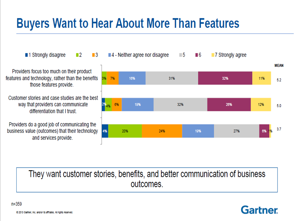
Sharing customer stories is a surefire way to give your business a competitive edge. According to a Gartner survey, 70% of executive buyers felt that case studies and customer stories are the best way to communicate trust.
In another study by Dimensional Research, 90% of buyers said reading positive customer success content influenced their buying decision.
In addition to customer stories, recognition and awards by peer bodies make a good first impression.
Were you featured in a leading magazine or voted the best B2C business? Show off your accomplishments on your homepage.
 Image Source: Variety
I was watching Netflix’s limited series Self Made. In the show, Madam Walker is giving a speech to convince Saunders Pharmacy to stock her hair product on their shelves. Less than a minute into her pitch, the company’s representative tells her he’s heard enough.
Apparently, there’s no need for a pitch because Madam Walker has a reputation that precedes her. She’s been featured in the New York Times and other leading publications. It’s not a website, but a great reputation builds trust with any audience.
Take a look at the homepage of Cardinal Digital Marketing. It’s a picture-perfect representation of how to build trust with your audience.

They’ve got awards and recognitions
 Top clients they’ve worked with
 Case studies showing what they did
 Video testimonials from happy customers
Social Proof
In an article I wrote on using Cialdini’s Principles of Persuasion to Increase Conversion, I talked about the importance of social proof. I gave an example of Betfair’s landing page that used social metrics to prove that people love their offer.
Cialdini believed humans do what they see others doing. “If Mr A and Ms C like your product, you must be doing something right.”
In another article on website copywriting, I talked about how people hate being sold to.
Adding testimonials to your homepage is a great way to neutralize skepticism and penetrate walls your potential buyer has put up. Social proof is powerful when it’s customers that have similar pain points as your target audience. Include a name and photo to your testimonials for extra credibility.
Optimize for Mobile Users
You want both mobile and desktop users to have a delightful experience on your website’s homepage. In countries like the U.S, more Google searches take place on mobile devices than on desktop.
Mobile-friendly websites perform better on search engines and provide a better user experience for visitors browsing on a mobile device.
Make sure your images, text and overall design work for mobile. Use larger fonts for headlines and sub-headlines to ensure visitors don’t have to squint to read your copy. Make your CTA buttons touch-friendly and include high-quality images compressed for mobile.
Remember SEO
One of the biggest decisions you’ll have to make is choosing a keyword for your homepage. This is especially tricky if you offer services that make it harder to pick one keyword.
What is the first thing people think of when they picture your company? If you offer accounting automation services in New York, that keyword doesn’t drive any traffic.
Think of verticals you can leverage like accounting services in New York, New York Accounting company and Accounting services NY.
When optimized properly, your homepage can rank for multiple keywords and drive a ton of relevant traffic.
Start with keyword research to find high volume, long-tail keywords. Optimize for secondary keywords that complement the primary keyword on your homepage.
Hire a website copywriter who understands how to do keyword research and optimize your content for the user and search engines.
Add your keyword or its’ variant in the:
- Headline
- H2 headings
- Title tag
- Image alt text
- Body of text
- Meta description
However, don’t try to rank for all your primary keywords on your homepage or you’ll end up not ranking for anything.
I’m one of those web visitors who scroll down to the footer to find information about a business. I’m looking for a link to the blog, contact page and other shortcuts that help me navigate the site.
Your footer should also include social media buttons to encourage visitors to interact with your brand outside your website. Other elements to add in the footer include:
- Badges for social proof
- Maps
- Email signup form
- Galleries
- A call to action
Conclusion
Be yourself. There are probably 1,001 brands offering the same service you do. Infuse personality into your homepage content to stand apart from the crowd and attract a like-minded audience. Write a simple homepage content that conveys your unique value and builds trust with your audience.


